Aug 11, 2026 / 3 min read
Oriente: An Online Store for Kitchenware and Home Objects
By Ardijan Curi
Problem
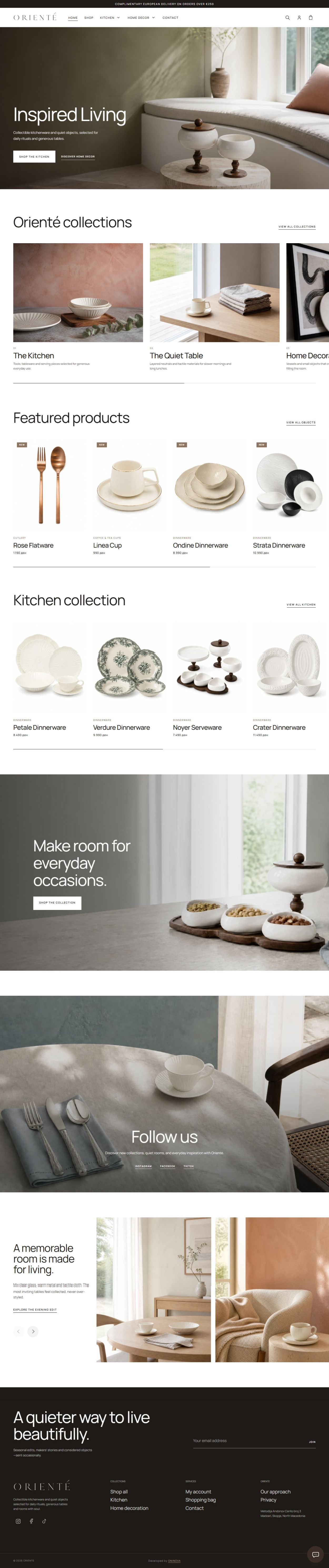
Oriente's products are chosen for their shape, texture, and small details. A basic product grid would not show that character well. At the same time, a highly decorative website could make products, prices, and buying actions harder to find.
The goal was simple: give the photography enough space while keeping the store easy to use.
What We Built
We built the full customer-facing online store. It includes the homepage, collection and category pages, individual product pages, the shopping cart, customer accounts, contact options, and newsletter signup.
The homepage introduces the brand through large images, selected collections, featured products, and lifestyle content. Customers can start with a collection or open a product directly.
How It Works
Customers can browse all products or open a focused category such as Kitchen. The Kitchen page first shows Dinnerware, Cutlery, and Coffee & Tea Cups, then displays the products in a simple grid. Customers can sort the list, open a product, or add an item to the cart.
Each product page brings the buying information into one place. Large photos show the product from different angles. The price, quantity, Add to Cart button, delivery details, dispatch time, description, and related products are easy to find.
View the Ondine Dinnerware product page
Key Features
- Homepage with collections, featured products, and lifestyle content
- Kitchen categories for Dinnerware, Cutlery, and Coffee & Tea Cups
- Product search, sorting, and clear navigation
- Large product galleries with useful descriptions
- Price, quantity, delivery, and dispatch information
- Shopping cart and customer accounts
- Related products that help customers continue browsing
- Newsletter, social media, contact, and WhatsApp support links
Challenges
The main challenge was using large product and lifestyle photos without making the store difficult to navigate. We kept the menus, product names, prices, and buttons simple so the images could remain the visual focus.
Long pages also needed to stay clear on different screen sizes. Product cards, image galleries, and buying information had to keep the same order and spacing across the website.
Lessons Learned
Strong photography works best when the next action is obvious. Customers should always know where to browse, where to find the price, and how to add a product to the cart.
We also learned that a category page should explain the collection before showing every product. This makes the catalog easier to understand and gives each group of products a clear place in the store.
Next Steps
The website is ready for new products, collections, and seasonal content. Future work can focus on keeping pages fast, improving accessibility, and making product information even easier to scan as the catalog grows.